Redesign for Improved Customer Retention
Removing friction from the user journey by redesigning the key screens that make up the journey. By adopting industry standards and simplifying interactions, the new design allows for a more accessible and intuitive user journey.
Timeline
2023
Role
UX Researcher UX Designer
Tools
Figma Screen Reader

Problem
The Pets at Home company supplies products to the pet owners of the UK. They operate through in-store and online services and have a dedicated mobile application. However, the currently available application lacks in several aspects of navigation.
Solution
I worked on improving the shopping experience by analysing the current product through user testing and accessibility tools. I created a design system and optimised the current navigation, by redesigning the relevant flows.
I worked on improving the shopping experience by analysing the current product through user testing and accessibility tools. I created a design system and optimised the current navigation, by redesigning the relevant flows.
The original app's accessibility was tested using the Android application "ScreenReader". The test revealed that the application was not properly optimized for screen readers. Below are three of the many issues found during the accessibility audit. - Some navigation instances were not accessible during the test as they were not made interactive for the screen reader. - The menu remains open on opacity, which causes the screenreader to loop through it, without the option of closing it to continue with the task. - The exaggerated length of some pages, made it nearly impossible to navigate to complete a shopping experience flow.
Persona
I created a persona from brief interviews with current brand users, as a way to encapsulate the characteristics of a typical user of the Pets at Home application. I used this persona throughout the redesign to inform design decisions and make sure they aligned with the personas' behaviours.

I wrote a series of user needs to reflect the ones of some current or potential users; I reviewed the cards throughout the project to inform design decisions and make sure they aligned with the user needs created.
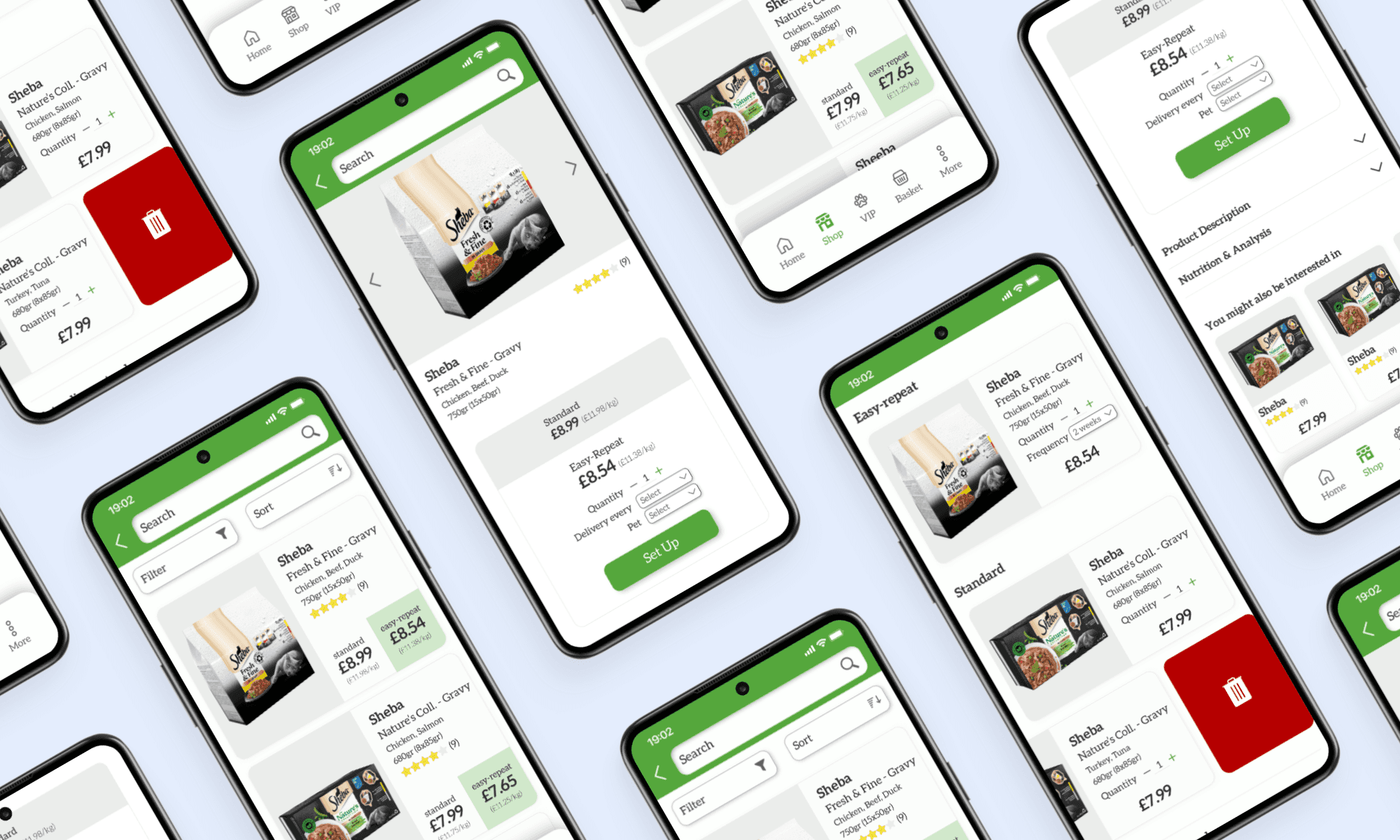
After conducting A/B testing on the redesigned Pets at Home app, it was found that the new design was significantly more accessible, user-friendly, and intuitive. Users reported that they were able to navigate through the app more easily and quickly and that the new design made it much easier to find what they were looking for. Additionally, the new design was found to be more visually appealing, with users reporting that they enjoyed using the app more than before. Overall, the A/B testing showed that the redesign was a success and that it had significantly improved the overall user experience of the Pets at Home app.
Research continues with some sessions at the Woolwich Library observing users interact with the different services; some o the observed users participated in individual interviews to learn more about individual needs. This exercise proved useful as it helped us understand the various needs and opportunities of the library and its users.